DC's New Corporate Logo --- It changes again!

General Discussions, Polls, Lists, Video Clips and Links
Post Reply
GeorgeC

DC's New Corporate Logo --- It changes again!

Post by GeorgeC » January 21st, 2012, 5:13 pm

For many years, monthly DC Comics, trade paperbacks, and hardcovers featured what was called the "DC Bullet." Image

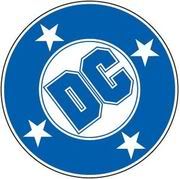
This was the corporate logo for at least a quarter century. It was officially replaced by the "DC Swirl" roughly ten years ago... Image


I'll be honest... I HATED the Swirl. It looked like DC was using a lavatory as a corporate symbol.
The "DC Bullet" had an understated chic style that was classical. It really didn't need to be discarded.

Now, the DC Swirl has given away to this ambiguous symbol (shown in a cluster of colors) => Image

Although I'm not trained as a graphic designer, I think I know bad design when I see it... and this is REALLY BAD!

Shoulda stuck with the Bullet, DC. It could have been animated nicely. (Picture a wheel "with DC" letters rolling onto screen followed by "star bullets" punching into it. Yeah, it might be sort of a James Bond rip-off but it's better than what was done with the Swirl...) The Bullet sure wasn't ambiguous on corporate identity... Nor did it subtly remind me of a toilet, either...

*************

Most companies are smart enough to stick with logos that readily identify them. 20th Century Fox hasn't changed its spotlight animation much over 50 years even though we're now in the 21st Century... Disney has stuck to a simple graphic of Sleeping Beauty's castle with a stylized "Walt Disney" signature for over a quarter-century. Universal used a globe with revolving lettering for decades. Paramount stuck by a mountain image with stars and a cursive lettering. McDonald's isn't going to abandon the Golden Arches any time soon.

You can't just go on changing logos time and time again and expect to build brand recognition anymore than you can expect to be known for quality if your goods are third-rate...

AV Forum Member
AV Forum Member
Posts: 608
Joined: January 22nd, 2007

Re: DC's New Corporate Logo --- It changes again!

Post by Whippet Angel » January 21st, 2012, 9:48 pm

Wow... That is seriously ugly. I certainly wouldn't think "comics" after seeing that

AV Forum Member
AV Forum Member
Posts: 126
Joined: December 8th, 2011
Contact:

Post by laughingoctopus » January 22nd, 2012, 12:12 am

I hate the logo, I liked the swirl though.

AV Founder
AV Founder
Posts: 7261
Joined: October 23rd, 2004
Location: SaskaTOON, Canada

Post by Randall » January 22nd, 2012, 12:33 am

I missed the bullet, but liked the swirl well enough. The swirl only got a few years in, though, before this newer logo came up... and just months after DC's big relaunch, which is weird. I can't say I'm a fan of the new logo, though it may grow on me.

The worst thing is... it's hard to read as "DC." I've read it's designed to be animated (with the D "switching identities" to the C), but as a static logo is doesn't work all that well.

GeorgeC

Post by GeorgeC » January 22nd, 2012, 8:58 am

The Bullet is so much better than the other two.

It's easy to read and traditional.

DC Comics were marked with the letters "DC" in them for decades before the Bullet was formalized -- the concentric ring was added with the four stars in it and the letters standardized in a custom font. The Bullet always looked good and readable regardless of whether it was printed in red, medium blue, black, or green. Those are the four colors I remember being used on comic book covers.

I remember seeing the bullet on ALL the 1980s and 1990s DC Comics covers. Before that, I've seen photos and read reprints with the less formalized circular DC logo.

Never understood WHY they felt the need to change the Bullet and abandon what was the company tradition.

Maybe it was a good thing in the end... Aside from the animated projects, I think DC's media projects have generally been disastrous and the constant continuity revamps ("re: Crises"), abandonment of basic characterizations and associated histories, and character mutilations have completely put me off the monthly comic book line.

Yeah, it's kind of good in that sense that the Bullet hasn't been so associated with critical failures and editorial misfires. (Didio, Johns, and Lee are utterly clueless... IMHO, this is the worst executive editorial team in comics right now.)

The sales don't reflect this yet --- still too early and the sales bumps won't last; 6-8 books have already been slated for cancellation ---, but the "52" re-launch is ultimately going to be a disaster... Between the hideous character redesigns and now the corporate "plastic surgery" it sure doesn't look like any DC Comics I'd recognize... I was praying that the architects of this mess would leave the company and some sanity could be restored but the wrong people always end up staying and getting their contracts lengthened!

User avatar
AV Founder
AV Founder
Posts: 25294
Joined: October 22nd, 2004
Location: London, UK

Post by Ben » January 22nd, 2012, 2:35 pm

I didn't mind the swirl either, but this is plain AWFUL!

It's so bad even they know it, since they even print "DC Comics" underneath! :roll:

Post Reply